Sigita Simona Paplauskaitė, architect of the LNM exhibition “Queens, Realms and Emotions”: the choreography of the exhibition spaces allows you to experience history personally
2025 08 25
How can one tell the stories of two different queens in a way that captivates, moves, and encourages us to rethink the role of women in history? Sigita Simona Paplauskaitė, architect of the international exhibition “The Queens, Realms, and Emotions” at the House of Histories of the National Museum of Lithuania (LNM), believes that exhibitions help us continually re-examine established interpretations of historical events and contribute to the creation of new ones.
In this conversation, the architect shares her thoughts on the creative process, the behind-the-scenes of working with a creative team, and the visual inspirations that shaped the exhibition’s structure—designed to present complex historical themes in a contemporary and engaging way.
The exhibition immerses visitors in the life stories of two 16th-century queens—Barbara Radziwiłł and Catherine Jagiellon. Its spatial narrative reveals not only the public and private aspects of their lives but also their emotional waves, the complexities of history, and the layers of myths that have surrounded them through time.
Interview by Kristina Tamelytė
-

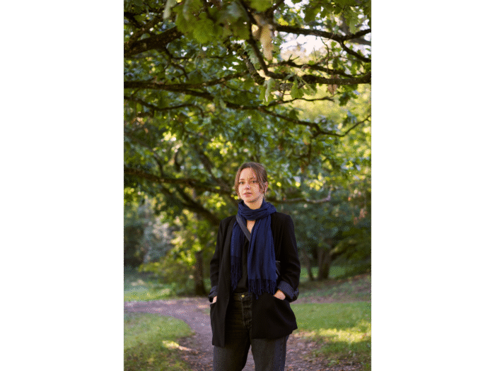
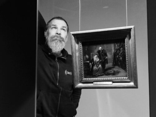
- Architect Sigita Simona Paplauskaitė Photo: personal archive
How does your creative process work? Whether we talk about “The Queens, Realms, and Emotions” or any other exhibition—when you receive an invitation to design its architecture, do you immediately see certain images or moods?
The foundation of most exhibition design processes is dialogue—with curators, educators, researchers, and other consulting specialists. I spend a lot of time analyzing the exhibition’s future content: reading textual and visual materials, browsing additional sources. Every exhibition is a new story, and the architect has a unique opportunity to help shape it. My curiosity often leads me to guided tours, lectures, and literary sources that broaden my perspective. While preparing, I note the most memorable aspects or the ones that raise intriguing questions.
I like to get acquainted with the material as early as possible—to think it through and take a pause before suggesting any spatial solutions. I also revisit the exhibition space itself and explore museum storage rooms for materials suitable for reuse. Sometimes, limited financial resources influence creativity—forcing me to find solutions that are not only interesting but also functional and sustainable. At some point, all these considerations merge and intuitively form a coherent idea.
When working on “The Queen, the Kingdom, and Emotions,” I was asked from the start to create a design that could later be moved to another venue—the Uppsala Castle Art Museum in Sweden. So, I had to think about how the design would “work” in a space of possibly different dimensions and how to make the exhibition easy to dismantle and transport. I decided to replace traditional exhibition walls with freestanding screens—allowing flexibility to add standard panels, rearrange or extend display surfaces, and recompose the structure to fit a new environment and narrative.
Walking through the exhibition feels like a gentle wave—you move as if sailing a ship or walking along folds of fabric, tossed between one shore and another. Life meanders.
I, too, felt like I was immersed in a sea of history while creating it (smiles). The exhibition is full of previously unknown information—charged with both political and feminine strength. I realized how endlessly these stories can still be interpreted.
When thinking about the exhibition’s architecture, I was inspired less by physical and more by symbolic imagery. One such image was the Möbius strip—when cut, it becomes longer, and if you cut it again, it lengthens once more. I imagined the exhibition having a similar effect: as another “cut through history” that expands and reinterprets known narratives.
The exhibition tells the stories of two very different women—Queens Barbara Radziwiłł and Catherine Jagiellon. How did you address their conceptual contrast?
-
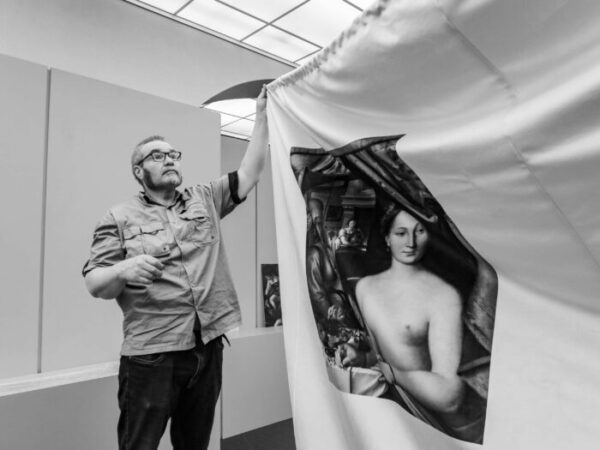
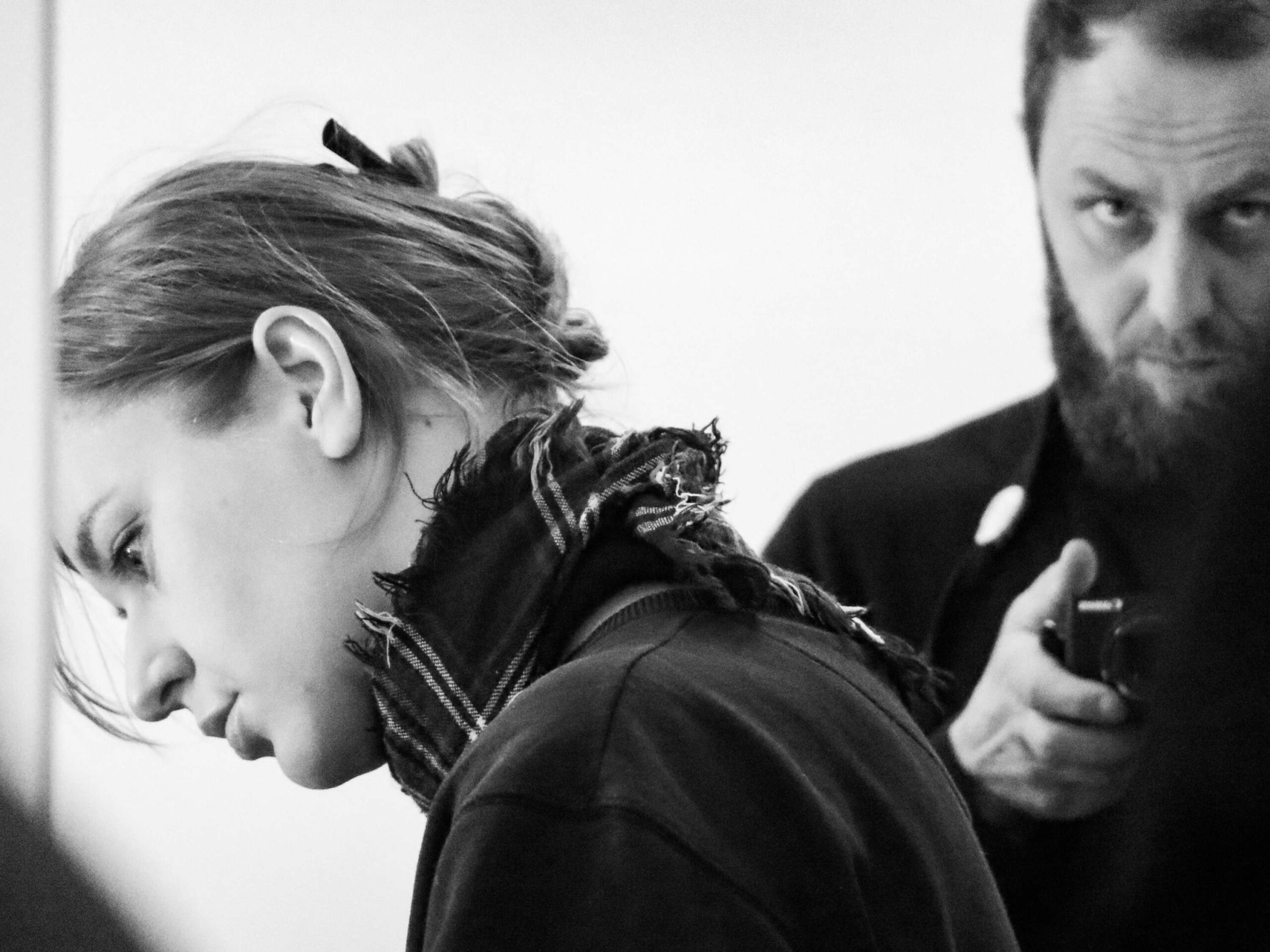
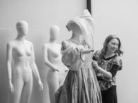
- Preparations for the exhibition “Queen, Kingdom and Feelings”. Photo: Vadim Shamkov

The exhibition opens with two portraits of the queens, created using artificial intelligence (artist: Tomaš Kadevičius). They reveal contrasting personality traits and invite visitors into a story that begins with their public image—social status, family life, courtly existence, and political networking through hunting. Later, the narrative becomes more intimate, unfolding their childhoods, interests, relationships, health challenges, and difficult paths to coronation. This part I wanted to make more theatrical, with spatial tension that allows visitors to feel as though they are part of the exhibit—while the artifacts themselves “float” freely behind transparent barriers. When the story turns toward the myths surrounding the queens, the narrative steps back again, offering an external perspective.
There were initial discussions about more strictly separating the two queens’ stories, but since they were contemporaries, it was fascinating to show parallels and contrasts by presenting their lives side by side according to thematic clusters.
It was important to me that visitors would not feel bound to follow the exhibition chronologically. One can start at any point—perhaps from the queens’ childhoods or from the section displaying contemporary theater costumes inspired mostly by Barbara Radziwiłł, thus experiencing the story from present to past. Different ways of “reading” these historical lines invite reflection and help construct—or deconstruct—cultural and historical myths.
What’s your favorite part of the exhibition?
I think it’s the color palette—how it activates the spaces and exhibits—and the way we managed to integrate longer texts seamlessly.
Another key element was distinguishing original artifacts from reproductions illustrating key moments or themes. Everything white in the exhibition—white-edged prints or mounts—doesn’t pretend to be authentic. It clearly signals to the visitor that it’s a reconstruction, important but recreated. Often, these pieces can be touched, lifted, unfolded, or even stepped into.
You chose the color palette with graphic designer Rokas Sutkaitis. How did that process go?
We began with four intuitive colors I proposed—deep cherry, violet, brown, and dark green. I’m glad Rokas wasn’t afraid of boldness; instead, he encouraged us to explore even stronger contrasts. I then turned to Sanzo Wada’s “Dictionary of Colour Combinations” and suggested a few alternative palettes. Rokas took another path—researching 16th-century tapestries and paintings featured in the exhibition, drawing hues directly from them. Eventually, we developed a color scheme that worked both for graphic design and architecture. Interestingly, the same color looks quite different when printed on different materials—and I loved that unpredictability.
One of the rooms in the exhibition is noticeably brighter—it focuses on the queens’ upbringing, childhood, domestic life, and food. Was this intentional, perhaps to reflect the emotional brightness of childhood?
Honestly—it’s mostly because there are so many exhibits (laughs). They require strong lighting, which naturally brightens the room. If there had been fewer objects or more integrated spotlights, it might have looked as dim as the first hall, where we explore royal families and hunting as a form of networking.
-
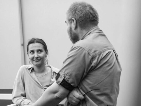
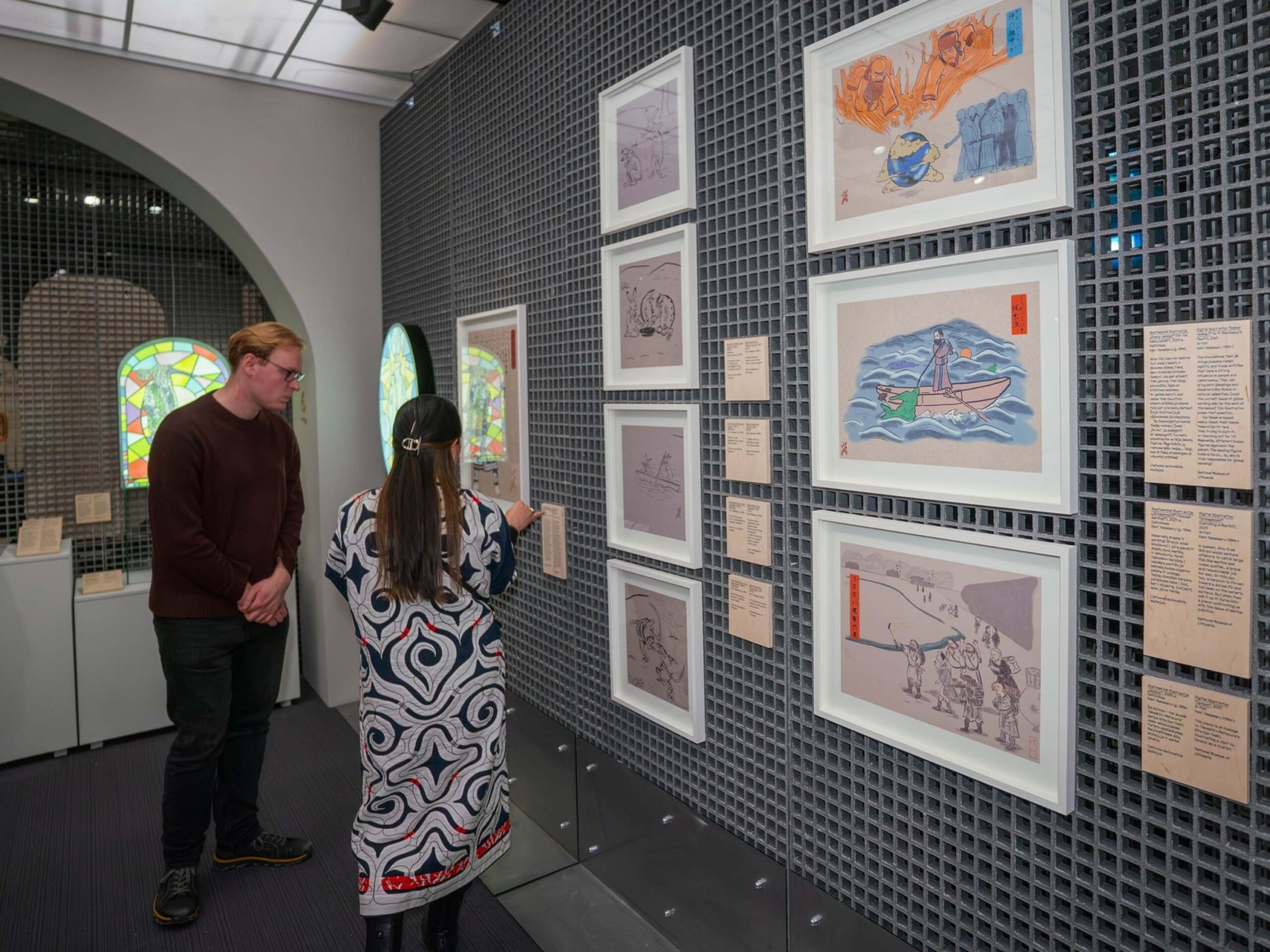
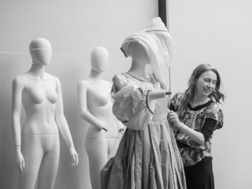
- Dominyka Verikaitė, Rimas Gecevičius. Preparation for the exhibition “Queen, Kingdom and Feelings”. Photo: Vadim Šamkov

You also worked with lighting designer Vilius Vilučis. How was that collaboration?
Before installing the actual partitions, I marked the entire future exhibition layout on the floor with strings—so I could explain to colleagues how visitors would move, where they would pause, what they would see, how object placement and corridor width would affect atmosphere. Early on, Vilius and I discussed the exhibition’s tone for each section, the difference in lighting between originals and reproductions, and other key points. For example, the opening section needed a classic museum atmosphere and softer light for a huge tapestry, while the modern segments called for cooler, contemporary lighting. Vilius is a wonderful artist—full of surprises and vitality. It was a joy to think, rethink, and feel through ideas with him.
How do you choose which exhibitions to work on, aside from practical considerations?
Deadlines, space, and the curatorial team are crucial, but I also need to feel genuinely interested in the topic. It doesn’t have to be something I already know about—sometimes the opposite: something I want to learn. In this case, the theme of women’s history was especially important to me.
It’s essential to believe in the exhibition’s message and to find connection with the team—each member contributes significantly to the process and final result.
You’ve said that exhibition architecture entered your life unexpectedly. How did that happen? Your original field is landscape architecture.
I don’t see landscape and exhibition architecture as opposites. Both are fundamentally about space—how people experience it and interact within it. In both, you design visual connections at eye level, movement paths, rhythms, and places for rest or encounter. Essentially, you choreograph space for diverse experiences.
When designing landscapes, you create conditions for living nature; when designing exhibitions, you consider not only how visitors feel but also how objects—a painting, manuscript, or coin—“feel.”
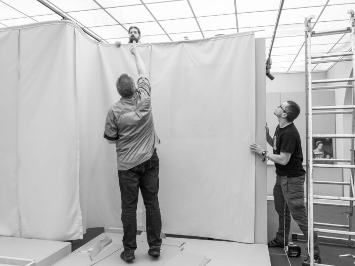
-

- Preparations for the exhibition “Queen, Kingdom and Feelings”. Photo: Vadim Shamkov
Working with exhibitions focuses you intensely, yet you’ve called yourself a “bad” exhibition visitor. Why?
I get tired of long texts, irritated by lighting contrasts—I always want to sit down, sometimes even lie down! I don’t always see everything in one go and often revisit earlier sections. I’m selective about what I read or listen to. Sometimes I can’t resist straightening a crooked frame (terrible, I know). So when working with an exhibition team, I remind them that visitors like me exist (smiles).
I try to propose inclusive solutions—spaces for rest, sensory variety, and accessibility not only for the most diligent but also for dreamier visitors.
Everyone experiences information differently and associatively. You don’t have to read or understand everything—by moving organically through the exhibition’s narrative, you can discover unexpected things. And honestly—it’s fine if someone finds it boring while another finds it fascinating. People’s moods vary; one day, nothing captivates you, and the next, you’re open to everything.
Exhibition design also considers different visitor needs. How do you approach that?
Indeed, we think a lot about this. There’s growing attention to making exhibitions accessible for children and visitors with various mobility needs. We’re learning constantly. Unfortunately, most museums still lack the funds to create fully accessible exhibitions for blind or visually impaired visitors—it’s very expensive.
However, “The Queen, the Kingdom, and Emotions” includes many multisensory elements: you can touch, climb, listen, and even smell. The exhibition also has an audio guide and a dedicated children’s education area inviting them to experience the queens’ lives in playful ways.
-
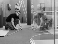
- Preparations for the exhibition “Queen, Kingdom and Feelings”. Photo: Vadim Shamkov

-

- Preparations for the exhibition “Queen, Kingdom and Feelings”. Photo: Vadim Shamkov
-
- Preparations for the exhibition “Queen, Kingdom and Feelings”. Photo: Vadim Shamkov
“The Queens, Realms, and Emotions” is open at the House of Histories of the National Museum of Lithuania (T. Kosciuškos St. 3, Vilnius) until January 4, 2026.